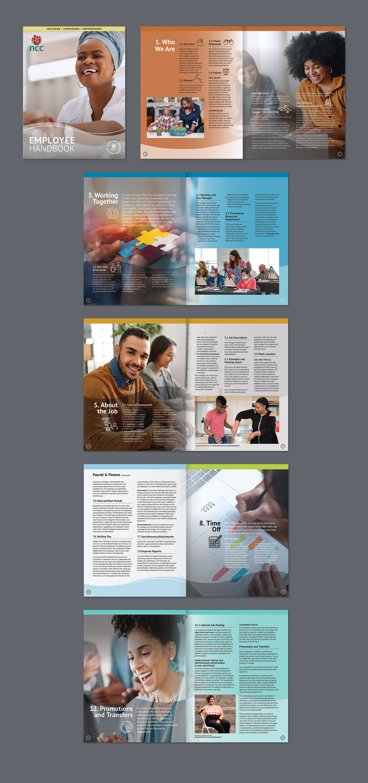
NCC Employee Handbook
> National Children's had a new design that they wanted to apply to other materials such as their Employee Handbook. The handbook had just been a Word Doc with very little visual interest. They wanted to provide their employees with a product that they would engage with.
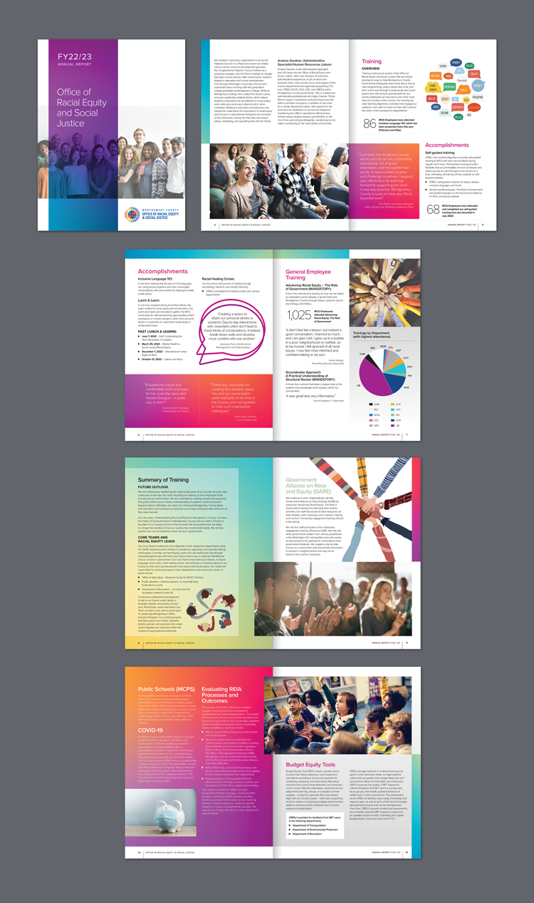
ORESJ (Office of Racial Equity and Social Justice) Annual Report
> Client wanted the report to reflect the colorful community they represent.
Jewish Federation of Greater Washington
> JFGW 2013 Annual Report — Thanking the Federation was the theme for 2013. The report design was an extension of a series of life size poster cutouts (being used at events) of those who benefit from the funds Federation provides and those who are involved with The Federation to help make the funds possible.
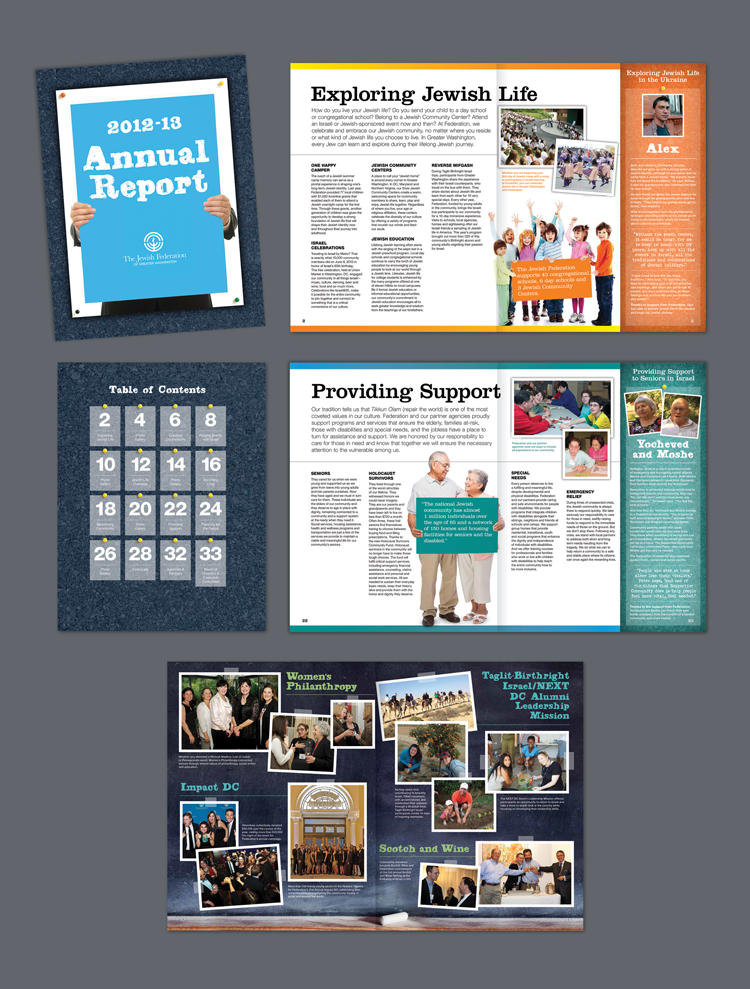
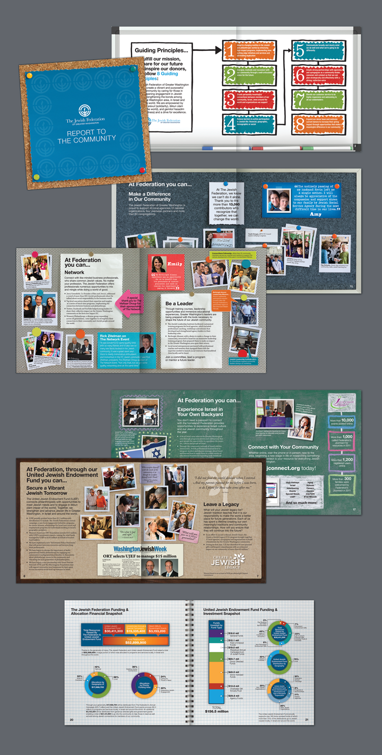
Jewish Federation of Greater Washington
> JFGW 2012 Annual Report — After a two-year hiatus, The Jewish Federation needed to produce an annual report. The focus for this report was the past, present & future of The Federation and YOU. There was a lot of information and imagery to share so, my approach had to do with the ways in which people present the layers of a year (or years) in review, like a scrapbook. So, each constituent spread became some sort of board: magnetic board, chalkboard, travel pin board, wipe board and so on. This design was a dramatic step away from the traditional approach that The Jewish Federation was so accustomed to.
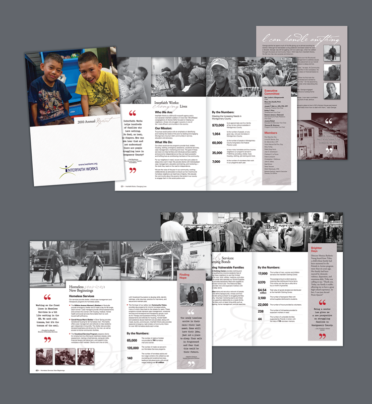
Interfaith Works
> Interfaith Works (IW) helps low-income families and the homeless in Montgomery County to move from crisis to stability through prevention, support and empowerment. IW found itself in a unique situation of needing financial assistance. Due to budget cuts in Montgomery County, because of a failing economy, they didn't have the funds to produce their 2010 annual report. They were awarded a grant through Taproot Foundation who provided Interfaith Works with a Marketing team complete with copywriter, photographer, project manager, designer, etc. It was an interesting venture and a great experience that lead to additional projects with Interfaith Works.
This was a pro bono project.